Tiered evidence for a sport with almost no data, and the accuracy headline that failed a per-class check
Most sports modelling assumes abundance. Women's international T20 gives you a career of thirty appearances and matchups four deliveries deep, and the standard approach turns that into confident numbers derived from noise. So graceful degradation is the actual product: four declared tiers of evidence, adjacent leagues blended at a discount, thin matchups discarded rather than trusted, and every output labelled with which tier it rests on. It also includes the accuracy figure I stopped quoting once I checked it per class.
6 min read
Contents
Most sports modelling assumes abundance. Thousands of matches, deep player histories, matchup records with enough deliveries to mean something.
Women's international T20 does not give you that. A well-established player might have twenty or thirty international appearances. A specific batter-versus-bowler matchup might be four deliveries. Build the standard model on that and you get confident numbers derived from noise.
So the interesting engineering here is not the optimiser. It is what happens when the data runs out — which it does constantly.
Degrading on purpose
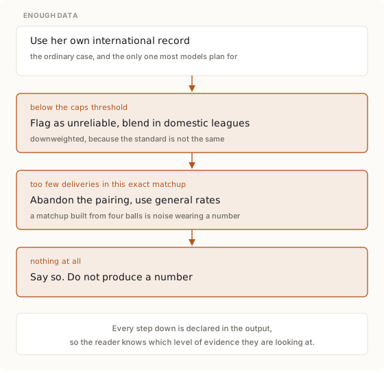
Four levels, and the system knows which one it is on.
Below a threshold of international appearances, a player's record is flagged as statistically unreliable and blended with performances from domestic competitions — downweighted, because the standard is not the same and pretending otherwise would import a different game's numbers at full strength.
For a specific matchup, fewer than a handful of deliveries faced means the pairing is discarded entirely in favour of each player's general rates. A matchup built from four balls is noise wearing a number, and it is worse than no matchup because it looks like evidence.
The part I would insist on anywhere: each level is declared in the output. A recommendation carries which tier of evidence it rests on. The failure mode this avoids is not inaccuracy — it is a thin estimate and a well-supported one arriving in the same typeface.
Two time budgets, two execution paths
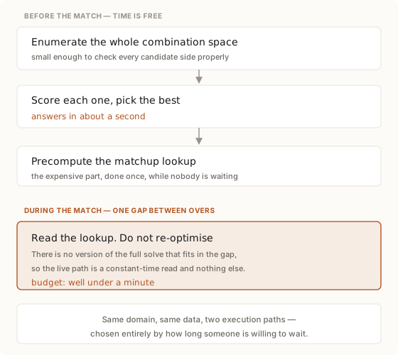
Before a match, time is effectively free. The combination space for a starting side is small enough to enumerate exhaustively, so there is no need for a heuristic search — I considered simulated annealing and rejected it as unnecessary machinery for a space you can walk in full.
During a match, the answer has to arrive in the gap between two overs. That is well under a minute, and no version of the full solve fits.
So there are two graphs. The live one does not optimise; it reads a matchup lookup computed in advance and answers in constant time.
Stating that as a rule: when a system has two response-time budgets that differ by orders of magnitude, it has two architectures. Trying to make one path serve both means either an unusably slow live answer or a needlessly crude pre-match one.
I also considered planning over belief states, as in three ways to not know things, and rejected it — cricket's state is fully observable. Everyone can see the score, the wickets and who is batting. Partial-observability machinery would be elaborate and pointless.
Why I am not quoting my own accuracy number
The report for this project leads with 61% outcome accuracy across 18 matches. I am not going to present that as a result, because when I looked at the breakdown while writing this, it does not survive contact.
The 18 matches split into two outcome classes. The model got 11 of 11 right on one and 0 of 7 on the other.
A model that simply always predicted the same outcome for the focus team would score 11 of 18 — the same 61%. So the headline figure is indistinguishable from the majority-class baseline, and it demonstrates no discriminative power at all on the class it got wrong.
There is a second problem. The 18 matches are what remained after 3 were excluded for rain and 9 more were dropped for incomplete data — nearly a third of the sample, removed by a criterion that correlates with exactly the sparsity this model is supposed to handle.
The runs estimation is the defensible part, and it is genuinely useful: mean error around 32 runs with a standard deviation of 23, 88% of predictions within 30%, and calibration that is good at the extremes while overconfident in the middle. That last detail is the honest one — when the model says something is close, it is less trustworthy than when it says something is one-sided.
I am leaving this in the post because the failure is instructive. A single accuracy headline hid a model with no skill on one class, and the breakdown was sitting three lines below the summary in my own report the whole time. If you have a percentage in a readme, check what it looks like per class before anyone quotes it back to you.
The pattern, without the cricket
In a sparse domain, graceful degradation is the product. Define the tiers of evidence explicitly, blend adjacent sources at a discount rather than at face value, refuse to produce a number when there is nothing behind it, and label every output with the tier it came from.
| Setting | Where the data runs out | The sensible fallback |
|---|---|---|
| Rare disease | Too few cases for a condition-specific model | Blend from related conditions, downweighted, and label it |
| New products | No sales history for a fresh line | Category priors at a discount, flagged as such |
| Emerging markets | Thin panels for a region | Neighbouring markets, discounted, never presented as local |
| Small-cohort HR analytics | Teams too small for significance | Report a range or refuse; never a point estimate |
| Fraud in a new channel | No labelled examples yet | Generic patterns, with the tier stated on every alert |
Three transfers:
Downweight when you borrow. Blending in adjacent data is right, and importing it at full strength is not. The discount factor is a modelling assumption that deserves to be written down and argued about.
Make "not enough evidence" a valid output. Systems that must always answer will always answer, and the answer will be confident and wrong precisely where the data is thinnest.
Check any headline metric per class before publishing it. This one cost me a number I had been quoting to myself for months.
References
| Source | Event | Recording |
|---|---|---|
| Intelligence in structure, not policy — structured methods benchmarked against learned ones | MLDS 2026, Mar 2026 | Not published |
| Calibration and honest reporting in production models | Data Engineering Summit 2026, May 2026 | Not published |
| A deployment gate that blocked a release on a single failing dimension | MLDS 2026, Mar 2026 | Not published |
| Full hall recordings across three days | CYPHER 2025, Sept 2025 | Day 3, Hall 3 |
Source is public: wt20-oracle. The accuracy report discussed above is in that repository, including the per-class breakdown that undermines its own headline.